Storm Harvey produced some extremely high levels of rainfall. Some areas of Texas received over 50 inches of rain over 9 days.
The National Oceanic and Atmospheric Administration (NOAA) provided some really great real time datasets to map the progress of the storm.
Among these were:
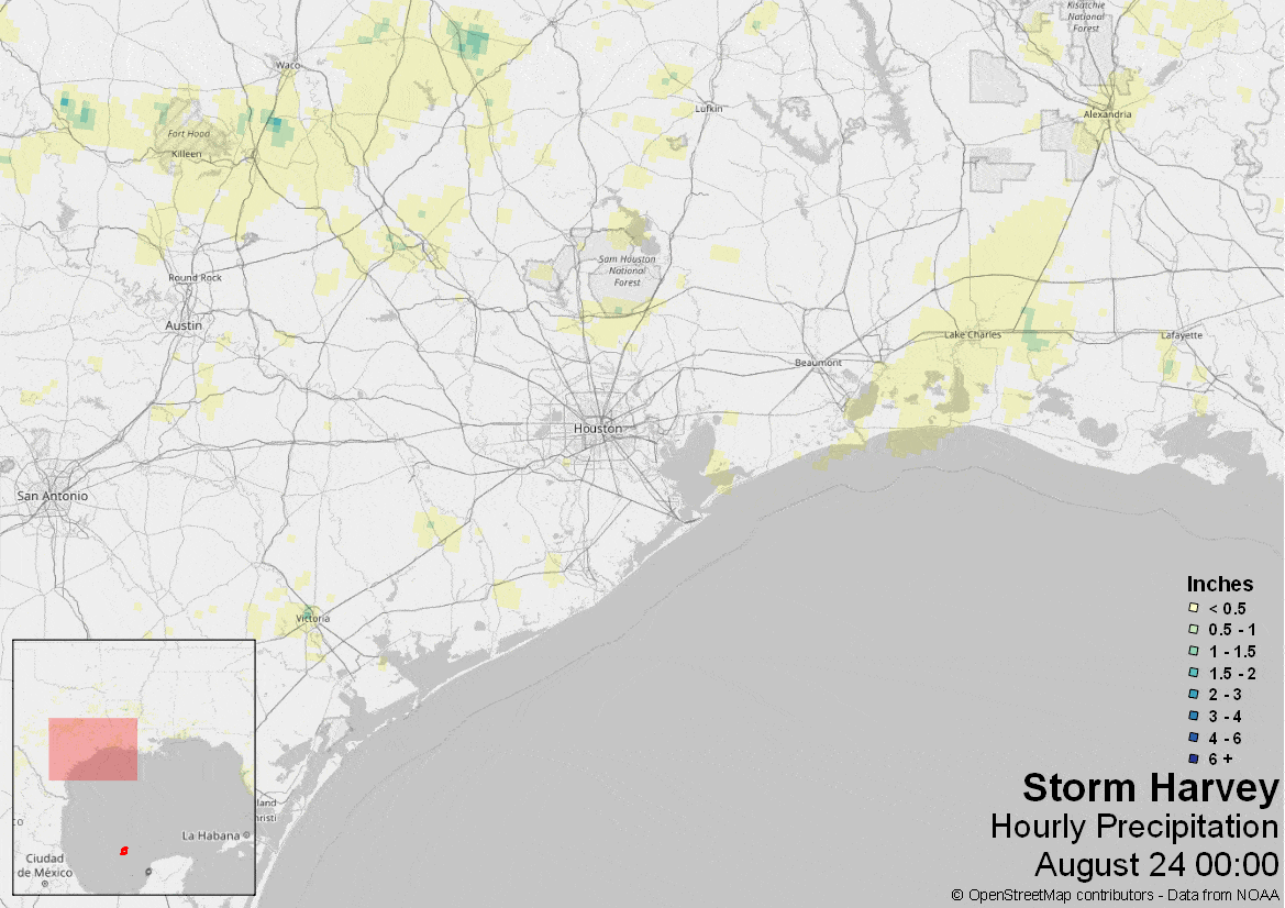
Hourly Precipitation
and
Hurricane Path
From these we can produce a GIF of hourly precipitation:
And total precipitation: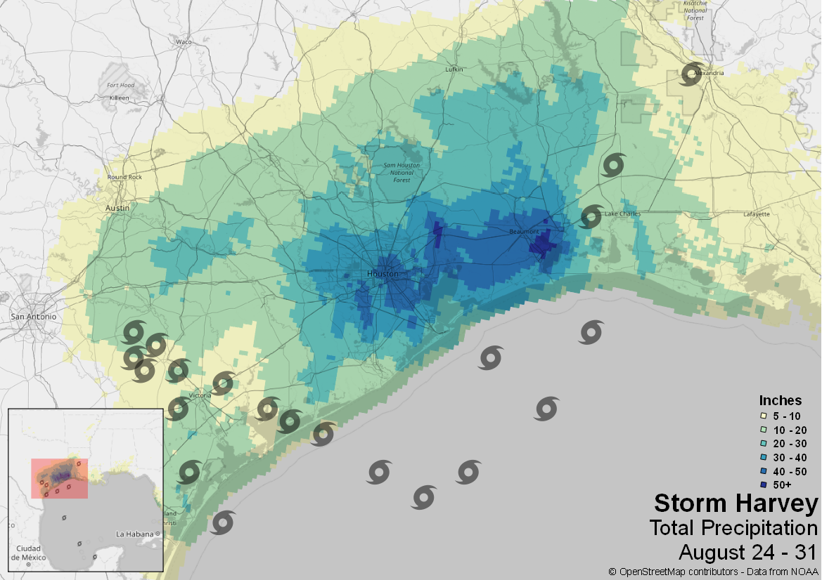
Particularly the hurricane path was possible to create in QGIS using the Atlas Generator, and the excellent new:ish geometry generator. This can be found as an option for any layers symbology, as one of the renderers.
For my map I had a non spatial table that drove my atlas. This was a log table of all of the hours of precipitation I had loaded into my database. So I looped through each entry and showed the corresponding points of hourly precipitation for the corresponding hour. I also had hurricane path data as points for every 6 hours. So I could use the geometry generator to interpolate points in between known points.
While the query ended up being pretty long it is pretty straightforward.
It only needs to be run when the hour being generated does not end with a 00, 06, 12, or 18, because those are the positions I already know.
For the rest I need to generate two points. One for the previously known point, and one for the next known point.
Then I would create a line between those two points, measure the line, and place a point on the line x times one sixth of the way for the start of the line depending on the hour from the last known point.
Overall I am very impressed and happy with the result. With a bit of data defined rotation the storm progress looks great.
line_interpolate_point(
Make_line(
geometry(
case when right(to_string(attribute(@atlas_feature , 'id')),2) IN ('00', '06', '12', '18') then
    get_feature(  @layer_name , 'dtg', attribute(  @atlas_feature , 'id') )
else
    get_feature(  @layer_name , 'dtg',  attribute(  @atlas_feature , 'id') - (attribute(  @atlas_feature , 'id') % 100 % 6  ))
end)
,
geometry(
case
    when right(to_string(attribute(@atlas_feature , 'id')),2) IN ('00', '06', '12') then
        get_feature(  @layer_name , 'dtg', attribute(  @atlas_feature , 'id') + 6 )
    when right(to_string(attribute(@atlas_feature , 'id')),2) IN ('18') then
        get_feature(  @layer_name , 'dtg', attribute(  @atlas_feature , 'id') + 100 - 18 )
    when to_int(right(to_string(attribute(@atlas_feature , 'id')),2)) > 18 then
        get_feature(  @layer_name , 'dtg',  attribute(  @atlas_feature , 'id') - ((attribute(  @atlas_feature , 'id') % 100 % 6)  ) + 100 - 18)
    else
        get_feature(  @layer_name , 'dtg',  attribute(  @atlas_feature , 'id') - ((attribute(  @atlas_feature , 'id') % 100 % 6)  ) + 6)
end)
),
length(Make_line(geometry(
case when right(to_string(attribute(@atlas_feature , 'id')),2) IN ('00', '06', '12', '18') then get_feature(  @layer_name , 'dtg', attribute(  @atlas_feature , 'id') )
else get_feature(  @layer_name , 'dtg',  attribute(  @atlas_feature , 'id') - (attribute(  @atlas_feature , 'id') % 100 % 6  ))
end
)
,
geometry(
case
    when right(to_string(attribute(@atlas_feature , 'id')),2) IN ('00', '06', '12') then
        get_feature(  @layer_name , 'dtg', attribute(  @atlas_feature , 'id') + 6 )
    when right(to_string(attribute(@atlas_feature , 'id')),2) IN ('18') then
        get_feature(  @layer_name , 'dtg', attribute(  @atlas_feature , 'id') + 100 - 18 )
    when to_int(right(to_string(attribute(@atlas_feature , 'id')),2)) > 18 then
        get_feature(  @layer_name , 'dtg',  attribute(  @atlas_feature , 'id') - ((attribute(  @atlas_feature , 'id') % 100 % 6)  ) + 100 - 18)
    else
        get_feature(  @layer_name , 'dtg',  attribute(  @atlas_feature , 'id') - ((attribute(  @atlas_feature , 'id') % 100 % 6)  ) + 6)
end)))
*
((attribute(  @atlas_feature , 'id') % 100 % 6) * 0.16666666666666666))