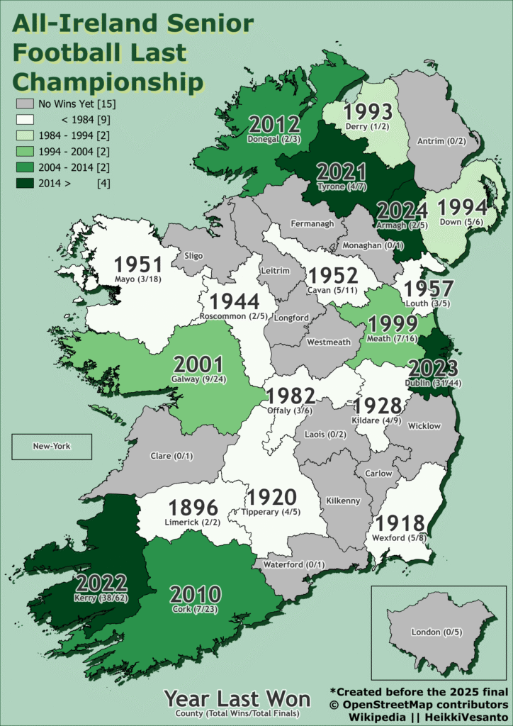
Donegal plays against The Kingdom (Kerry) this weekend, for the Sam Maguire Cup in the All-Ireland Senior Football Championship.
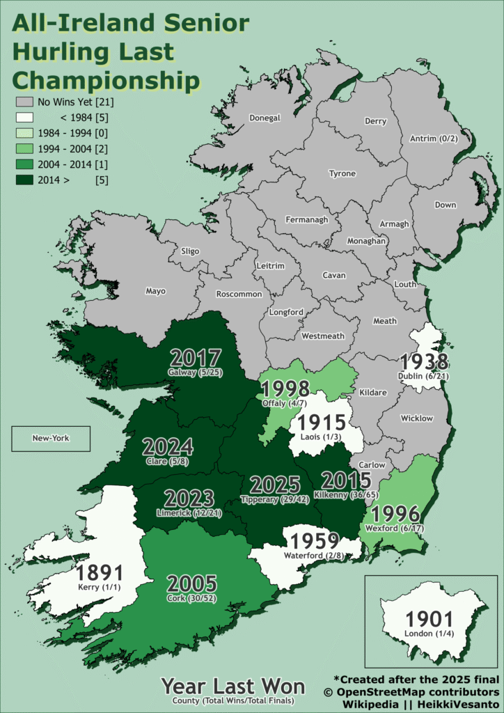
All-Ireland, but interestingly Kilkenny does not foot a team, focusing on hurling, but New York and London both do.
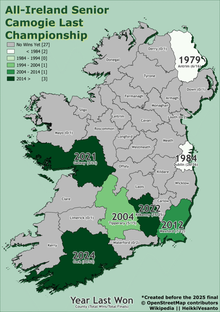
A follow up to the animated maps from a few years ago: GAA Winners 1887 to 2017 GIFs
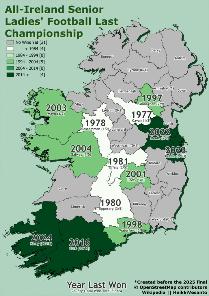
This is the last win for each county mapped by sport.