Storm Éowyn was an extremely powerful and record-breaking extratropical cyclone that struck Ireland, the Isle of Man, and parts of the United Kingdom on 24 January 2025.
Éowyn was the most powerful and severe storm to hit Ireland since Hurricane Debbie in 1961. The wind speeds recorded during the storm broke an 80-year-old record for the country (1).
Based on analysis of Copernicus Climate Change Service wind gust data ranging back to 1960, around 30% of Ireland experienced the highest gust speeds on record, including most of Meath, Longford, Louth, Westmeath, Galway, Roscommon, and Cavan.
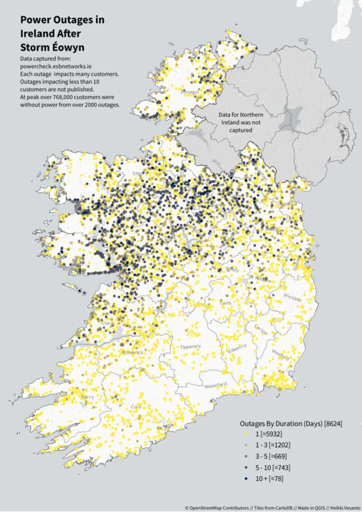
Storm Éowyn had a significant impact, particularly in Connemara and the Midlands of Ireland. Where the storm left widespread devastation, with over 130 power outages still being recorded two weeks later by ESB Networks, despite thousands of outages being fixed in that time.
The outages peaked at over 2000 outages impacting 768000 customers.
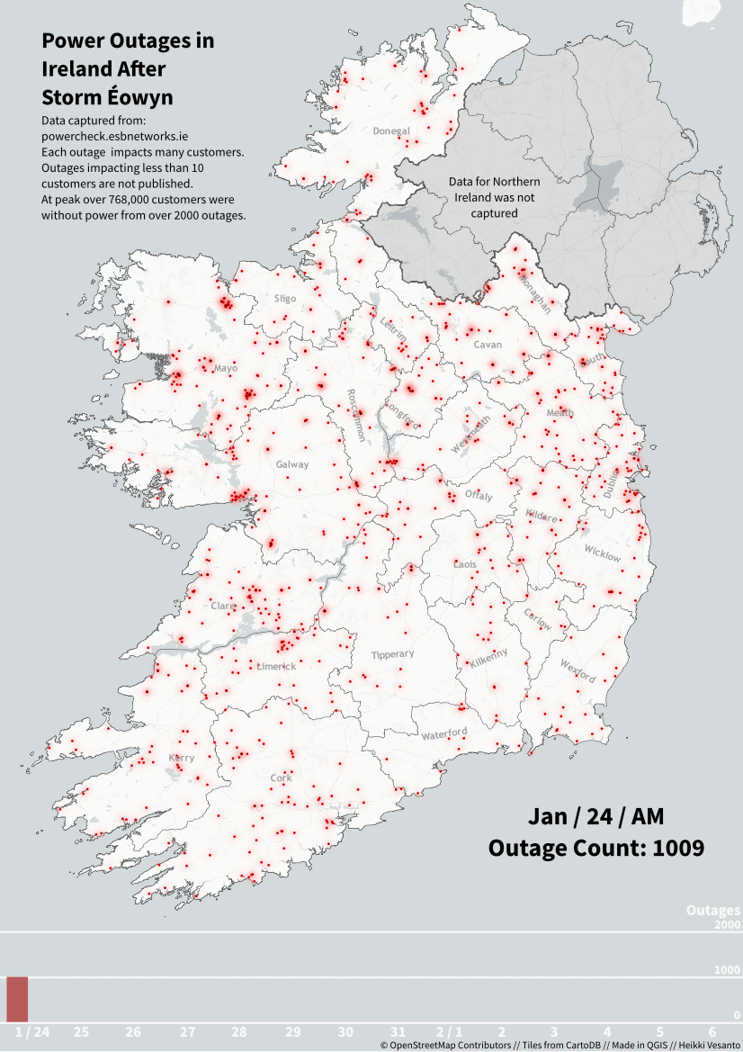
In total over 8500 outages were recorded.
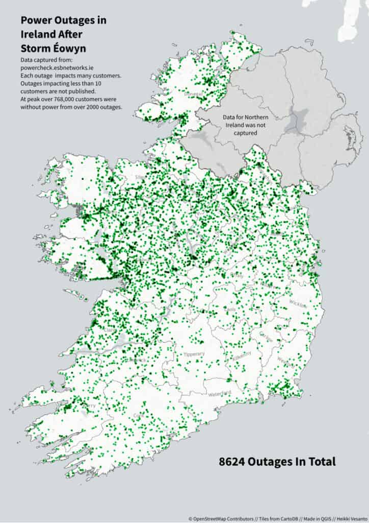
With many lasting for over a week, with some customers without power for over two weeks.