This November I once again took part in the 30 Day Map Challenge started by Topi Tjukanov.
I had done it the first year (30 Day Map Challenge 2019), and had made a few maps for 2020 as well.
This year I wasn’t really sure I would take part, as I had no plans and nothing prepared. But it is a great challenge. It challenges your creativity, problem solving, and map making skills. It also sets a time limit so you don’t have to worry about being perfect. And making maps is good fun.
There were a few datasets that I had come across that I thought would be good subjects, and I got a lot of mileage out of them.
Dublin neighbourhoods
These included the Dublin Inquirer neighbourhood survey.
Will You Draw Your Dublin Neighbourhood for Us?
neighbourhoods.dublininquirer.com
I think this is a great initiative, and hopefully they get a real large set of responses. They are at over 2000 already so a great start.
I did something similar for Glasgow (here) but only got 367 responses in total. So the power of having a well read paper behind the initiative is great. They are also reaching out to areas that have not had many responses, which is really great work.
OpenStreetMap
I also wanted to do some maps around OpenStreetMap in Ireland. The community here has had a large push to map all of the buildings in Ireland, which has progressed well.
But it is very much a work in progress.
OSM Ireland Buildings poster from State Of The Map 2021
Selected Maps
Hexagons:
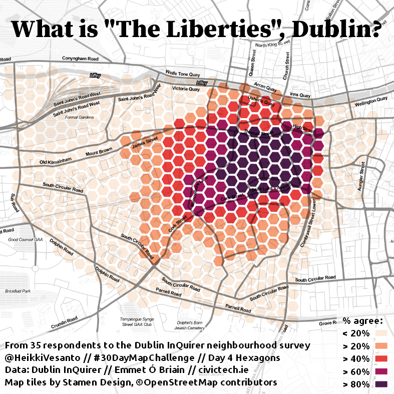
First of the Dublin boundaries series.
Final interactive version: Here
OpenStreetMap:
For OSM day I wanted to try and make the data a bit easier to use for #QGIS novices.
I created styles that can be applied to the GEOFABRIK Shapefile extracts, from here.
The styles are available: https://github.com/HeikkiVesanto/QGIS_OSM_Styles
Red:
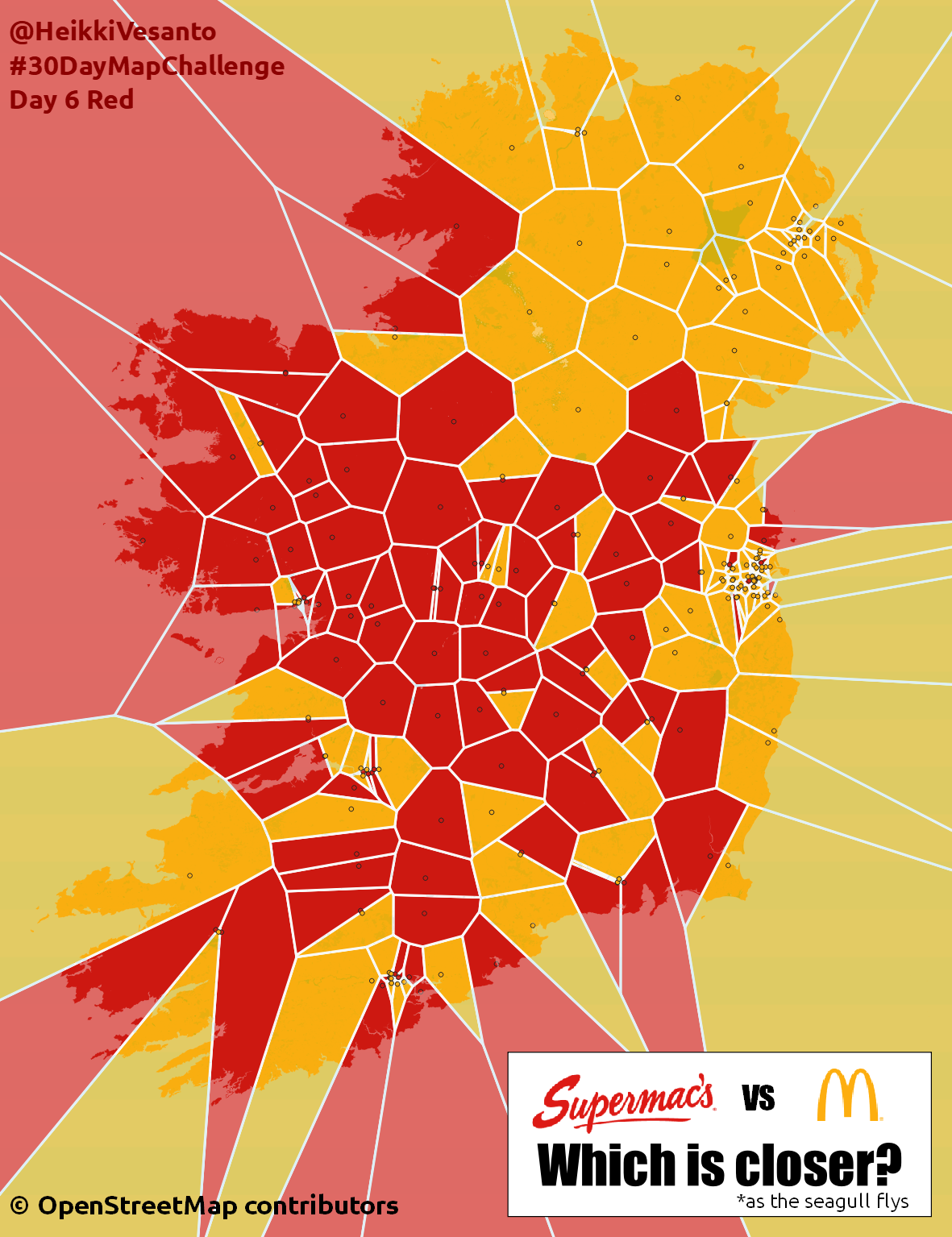
Mac vs Mc.
Supermac’s is an Irish fast food restaurant chain, who have had a few trademark disputes over the years with McDonald’s over the use of Mc and Mac in burger names.
3D:
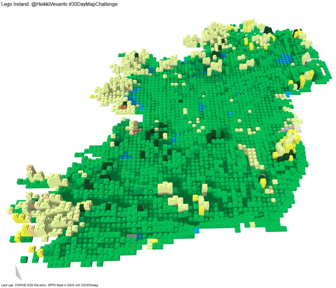
This turned out a lot better than I expected.
Was pure QGIS. Create grid (5km x 5km), zonal statistics on CORINE (Majority) and DEM (Median). New field for height rounded up to the nearest 40:
to_int(ceil((“_h_median” / 40))) * 40
Set colors. Create centroids with same colors. These become the Lego nubs.
Rendered in QGIS2threejs plugin. The grid is extruded, with a height of height * 50. The centroids are cylinder rendered height * 50 + 30 * 50, so they come a bit higher, radius of 1800.
The “rayshader” export makes it look realistic.
Interactive: https://maps.gisforthought.com/LegoIreland/
Might be better to not use landuse, but elevation for the colours.
No Computer:
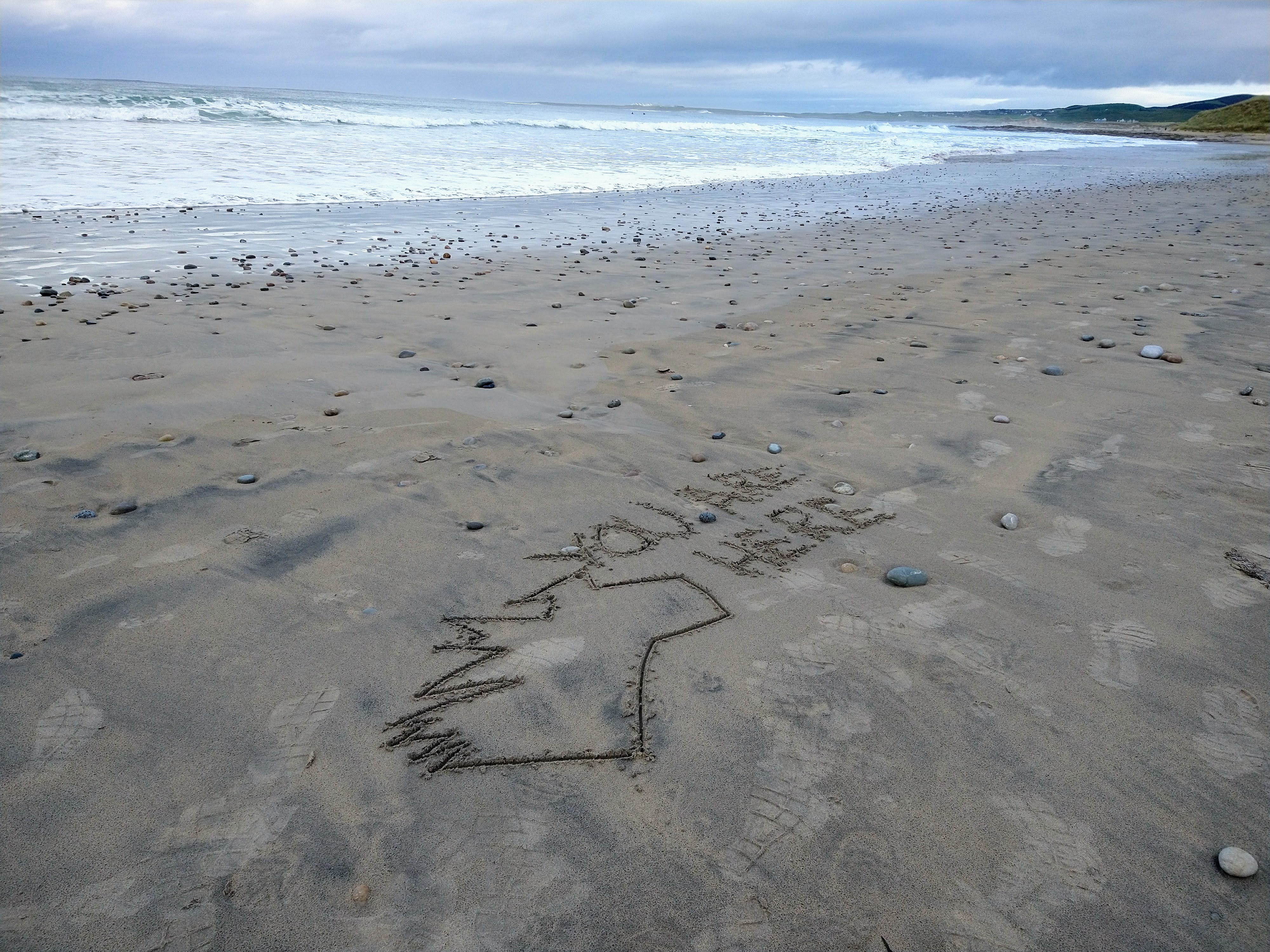
Nice to get away from the computer. Definitely promotes some creativity. But I just took it as an opportunity to walk on the beach.
Land:
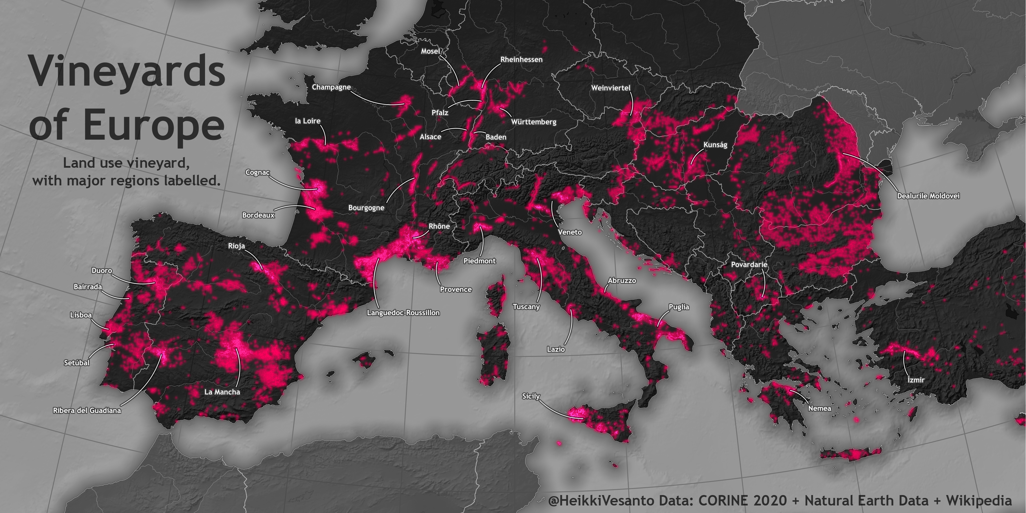
My favourite of my maps.
Land use vineyard across Europe from CORINE 2020, with the major regions labelled.
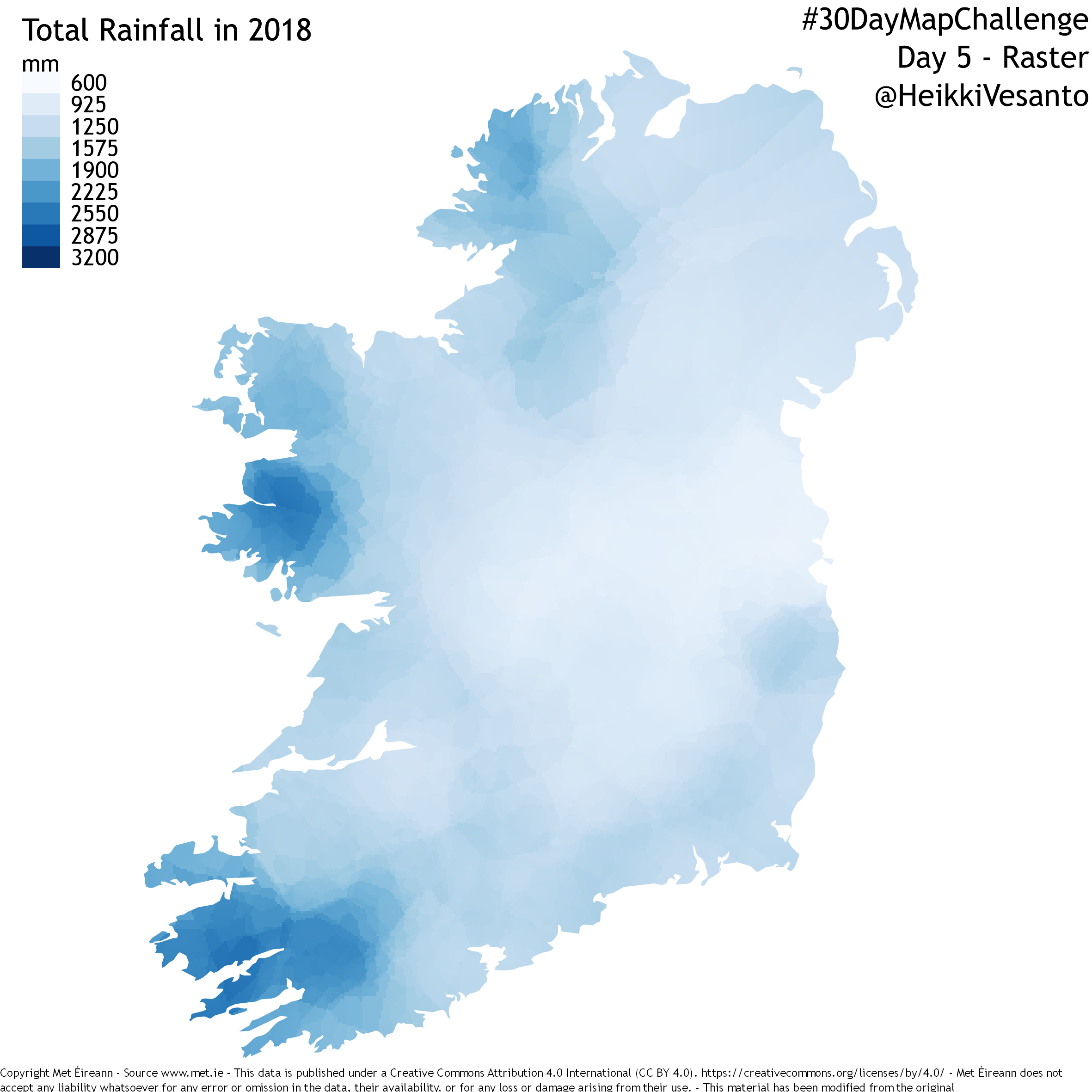
GHSL:
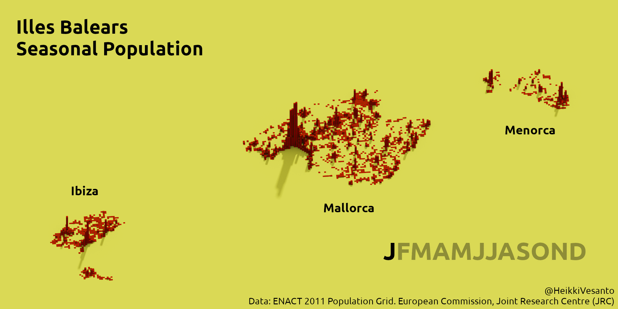
Seasonal population of the Balearic Islands.
Data clipping in QGIS/GDAL, rendered in Aerialod, with labels with GIMP afterwards.
This was my second favourite of my maps. I think the topic is interesting and the execution is pretty good. Was however quite manual and probably needed more exaggeration to see the differences.
Historical:
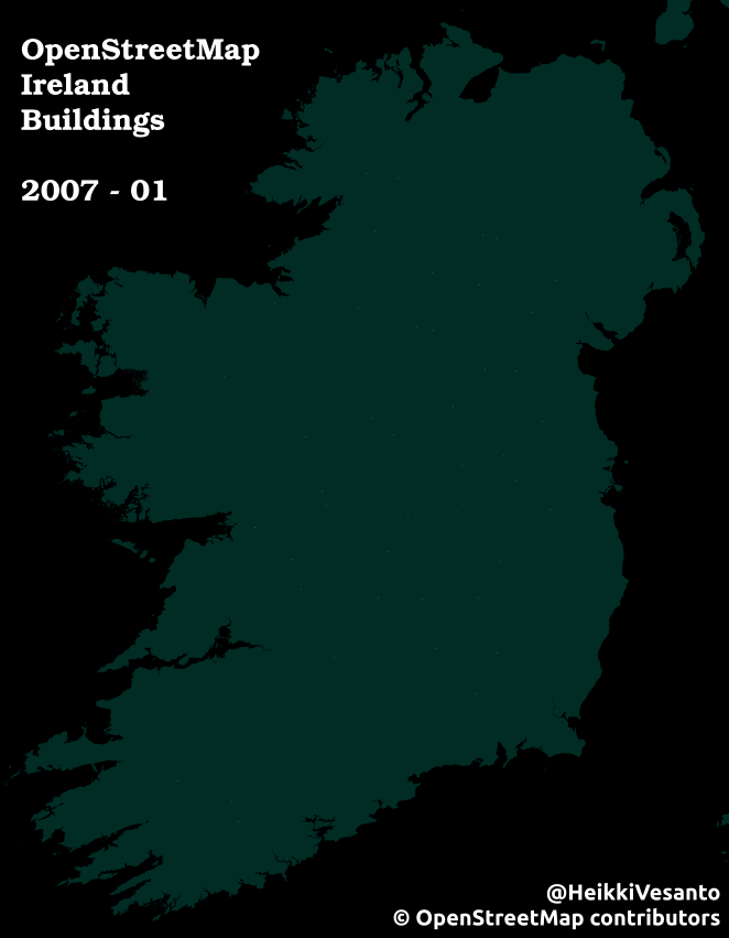
A time lapse of 1,831,044 buildings in Ireland being added to OpenStreetMap.
If you want to get involved see: OpenStreetMap Ireland Buildings
Globe:
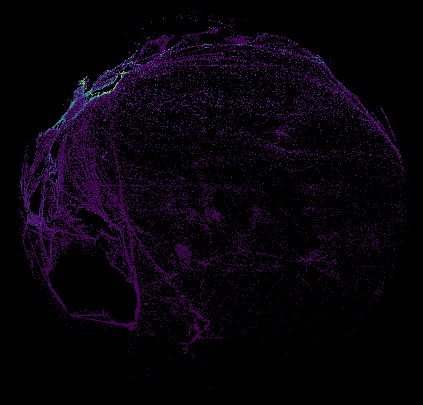
Simple spinning globe in QGIS, but I was happy that I was able to automate the export: Gist
All maps: