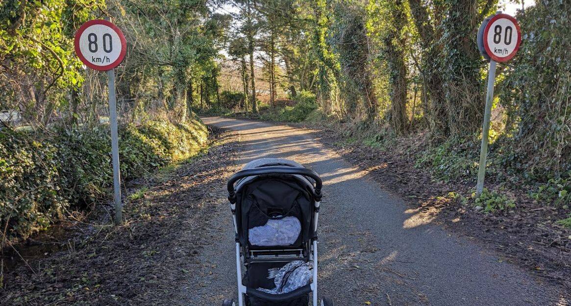
The speed limits for local roads in Ireland were changed from 80 km/h to 60 km/h in 2025. This impacted an estimated 73,000 km of roads. Gov.ie
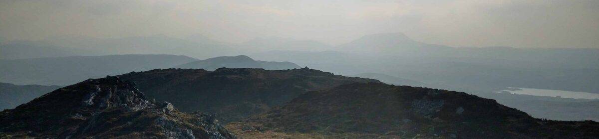
For many of these roads 80 km/h was certainly a limit, rather than an actual expected driving speed. Especially those that were single lane with poor visibility.
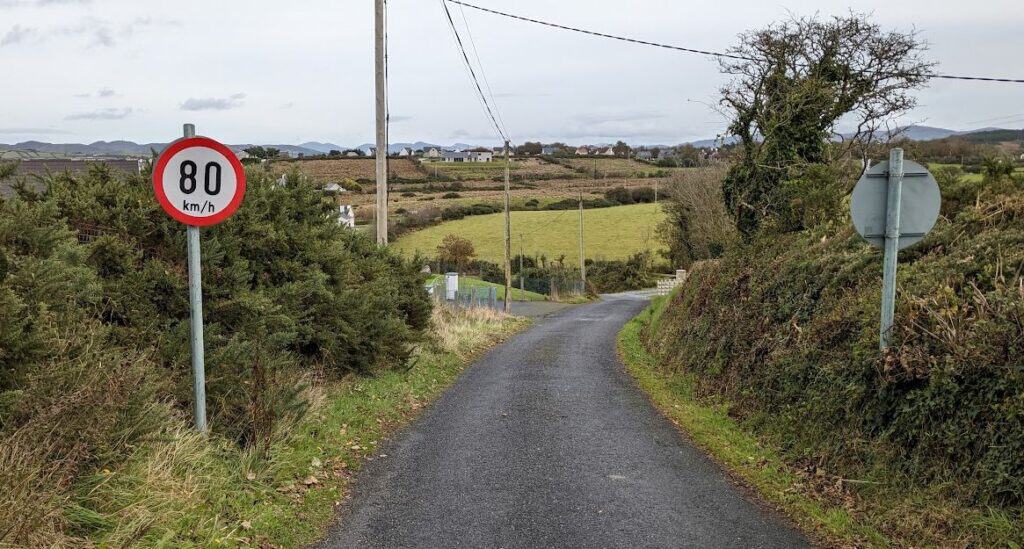
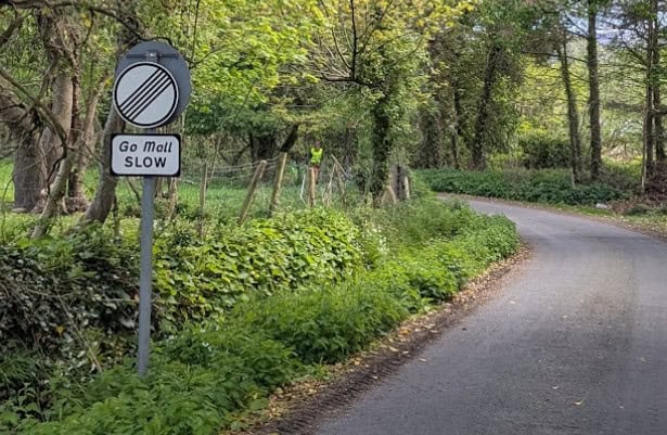
These roads are now designated with a Rural Speed Limit sign.
Rural local roads were impacted, which is the largest class of roads in Ireland, with an estimated 60% of all roads in Ireland changing their speed limit.
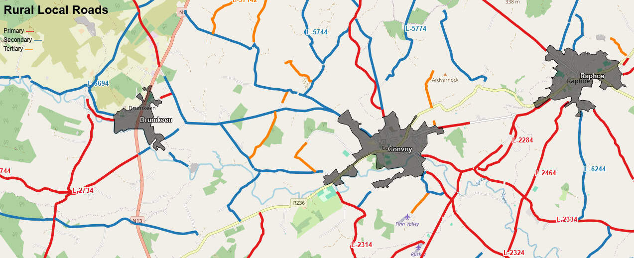
Interactive map of Local Rural Roads in Ireland:
Cork, Mayo and Galway having the most kilometers of impacted local roads, with 0ver 9000 km of roads in Cork alone impacted.
But from a % of roads perspective Roscommon, Longford, Sligo, Mayo, Monaghan and Cavan all see around 70% of their roads impacted.
| County | Local Roads Non Urban, km | Total Roads, km | Estimated % Impacted |
|---|---|---|---|
| Carlow | 972 | 1,622 | 60% |
| Cavan | 2,401 | 3,392 | 71% |
| Clare | 3,214 | 5,384 | 60% |
| Cork | 9,902 | 15,257 | 65% |
| Donegal | 5,043 | 8,506 | 59% |
| Dublin | 550 | 4,990 | 11% |
| Galway | 5,418 | 8,219 | 66% |
| Kerry | 3,709 | 5,648 | 66% |
| Kildare | 1,585 | 3,989 | 40% |
| Kilkenny | 2,449 | 4,049 | 60% |
| Laois | 1,697 | 3,045 | 56% |
| Leitrim | 1,719 | 2,522 | 68% |
| Limerick | 2,883 | 5,156 | 56% |
| Longford | 1,311 | 1,739 | 75% |
| Louth | 945 | 2,349 | 40% |
| Mayo | 5,449 | 7,345 | 74% |
| Meath | 2,453 | 4,692 | 52% |
| Monaghan | 2,065 | 2,890 | 71% |
| Offaly | 1,577 | 2,767 | 57% |
| Roscommon | 3,303 | 4,305 | 77% |
| Sligo | 2,297 | 3,079 | 75% |
| Tipperary | 4,406 | 7,275 | 61% |
| Waterford | 2,031 | 3,352 | 61% |
| Westmeath | 1,738 | 2,975 | 58% |
| Wexford | 2,747 | 4,780 | 57% |
| Wicklow | 1,485 | 3,255 | 46% |
| Total | 73349 | 122581 | 60% |