Inspired by /u/a_wandering_chemist on Reddit.
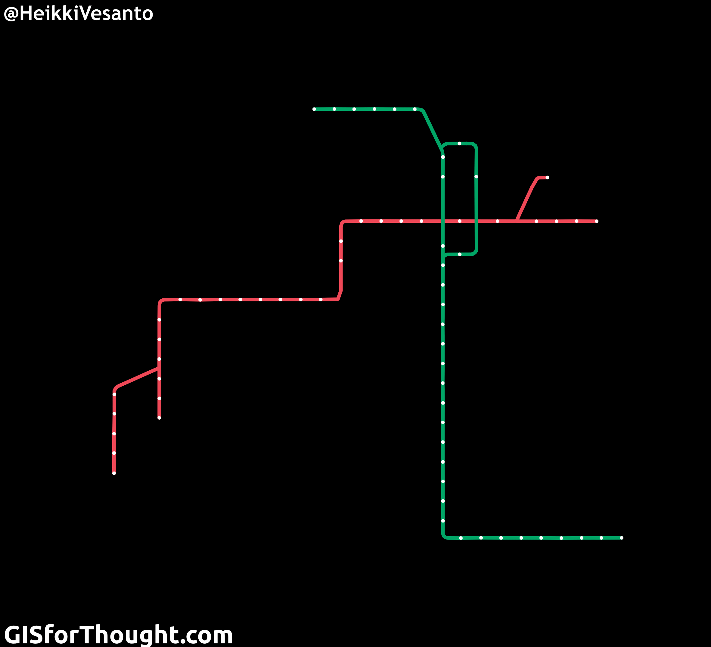
This is a look at how the map of the Dublin tram network, the Luas (Irish for speed), compares to the actual geographic footprint.
For a simpler view:
The processing of the transition is done in PostgreSQL with PostGIS, with the final animation in QGIS.