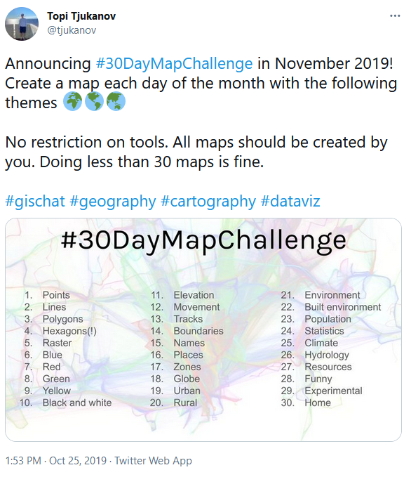
Last November I took part in the 30 Day Map Challenge. An excellent project suggested by Topi Tjukanov on twitter:
I perhaps had a bit of an advantage. I had already completed a very similar challenge in 2014. Mapvember.
Where I made a post on this blog every day for all of November, primarily maps.
Where I made a post on this blog every day for all of November, primarily maps.
And a summary:
https://gisforthought.com/mapvember/
There are a lot of advantages to this style of map creation and a few down sides.
Advantages
- It puts a time limit on the maps. This forces you to put them out there no matter the status. It is easy to leave maps half finished because they are not perfect. I know the internet can be a harsh critic sometimes, but you are making a map a day, it won’t be perfect.
- You can revisit some older maps that have been discarded in the past. Perhaps they didn’t look so good, weren’t so interesting. That doesn’t matter, you are posting a map a day they don’t have to be perfect.
- There are a lot of ideas out there. I use a Google keep note to store map ideas I have. The list keeps on getting longer and without some pushing it never gets shorter.
- Collaboration. There were some great maps made, and every day you could enjoy them as well, feeling part of the community. Sharing ideas and techniques.
- Increase your talents. The only way you are going to get better at mapping is by making some maps. No better way to do it than pushing yourself.
- Work with new data. 30 maps is a lot of maps. You can explore new datasets and new software.
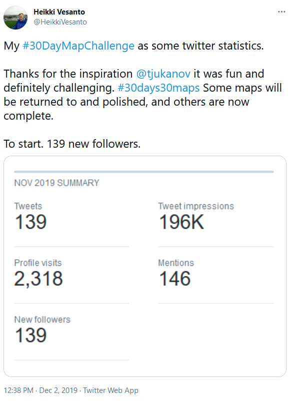
- Grow your following. As the challenge is on Twitter it is a good way to build your following. I got 139 new followers over the month. Now for some people that isn’t much. But I only have 600 in general so it’s a sizeable amount. Although I’m not sure there is that much value to followers. But 197k impressions is good? 1 follower per 1000 who saw a map.
Disadvantages
30 maps is a lot of maps to make. A day is a short time to make one. My tactic, based on my previous experience, was to make a few upfront and ready to go. So by the time November started I had a few maps ready, so I could be ahead of the curve.
I used tweetdeck to schedule the tweets. I didn’t map on the weekend for the most part. I had other commitments, so scheduling and making some easy maps was crucial to completing the challenge.
There are no real rules to the challenge, interpret it how you wish. Do a map a day, or a map a week, but the important part is enjoying it.
Maps
There is a great website that collects all the maps created by theme and creator:
https://david.frigge.nz/30DayMapChallenge/index.html
I have posted all of my maps here.
With a select few favorites:
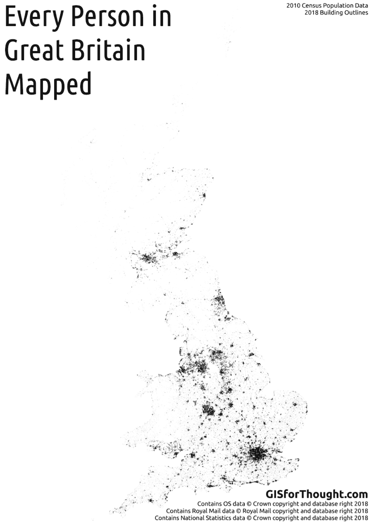
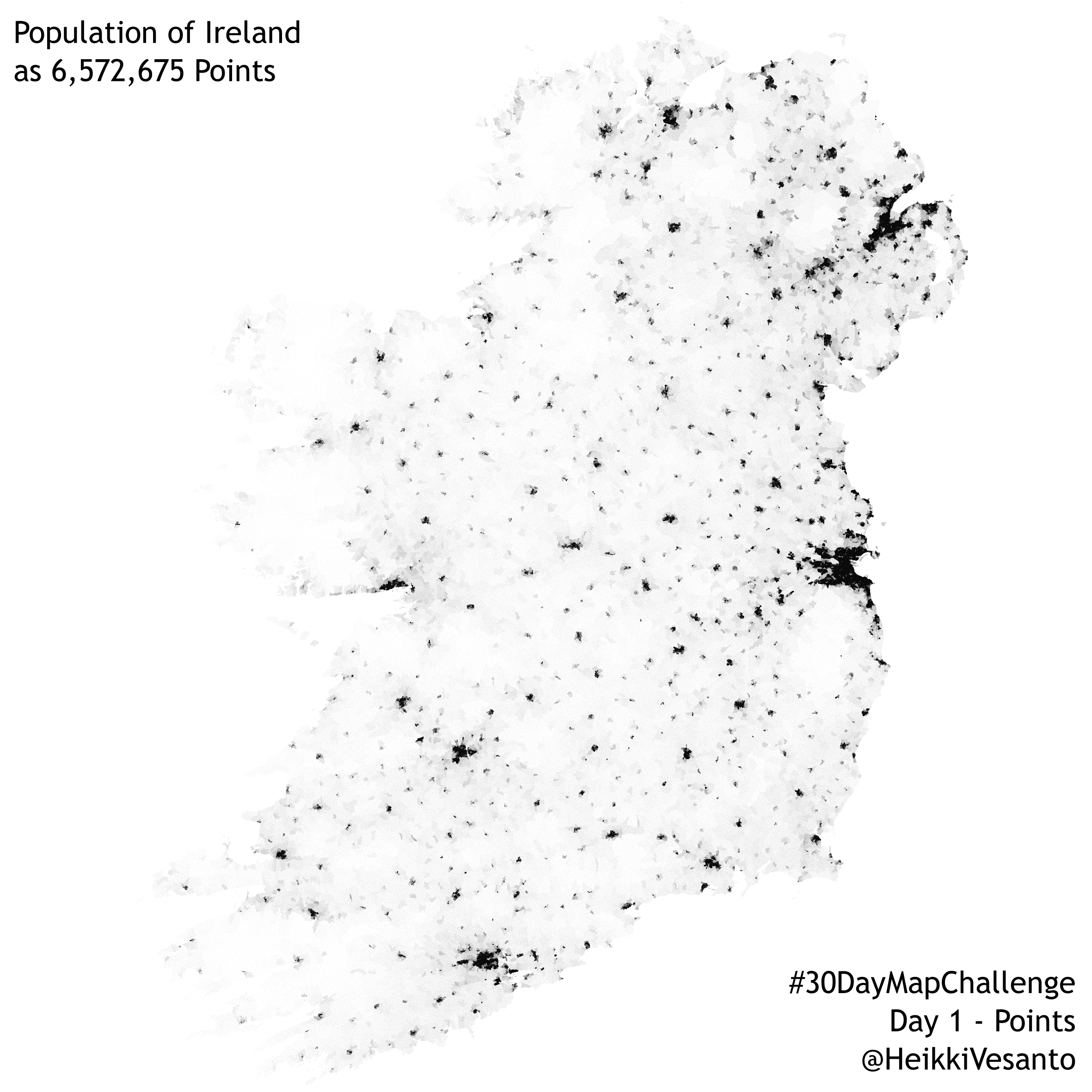
Day 1 – Points – Ireland’s population mapped as one point per person. 6,572,675 points in total:
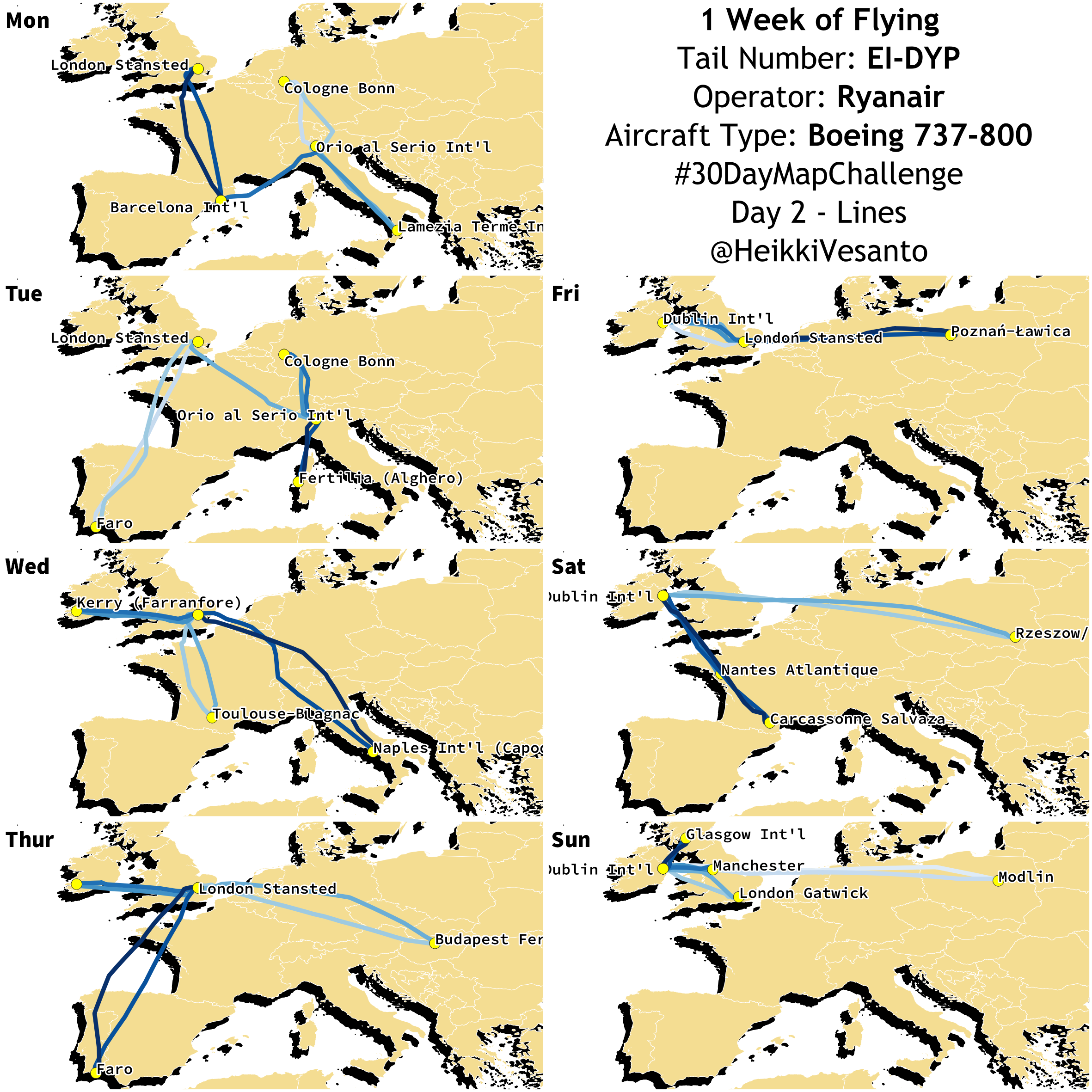
Day 2 – Lines – 1 week of flying for Ryanair EI-DYP Boeing 737-800:
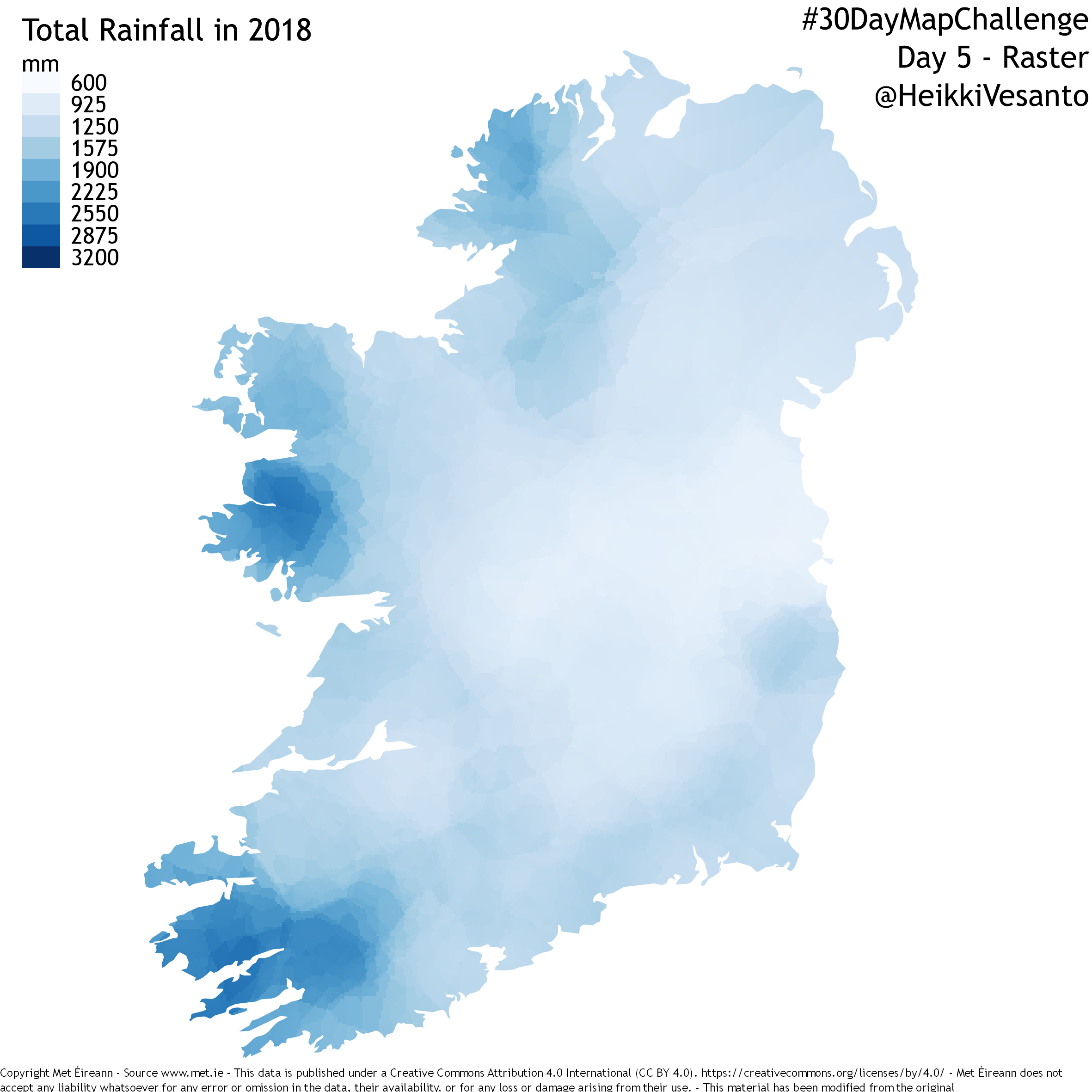
Day 5 – Raster – Total rainfall in Ireland in 2018 from Met Eireann data:
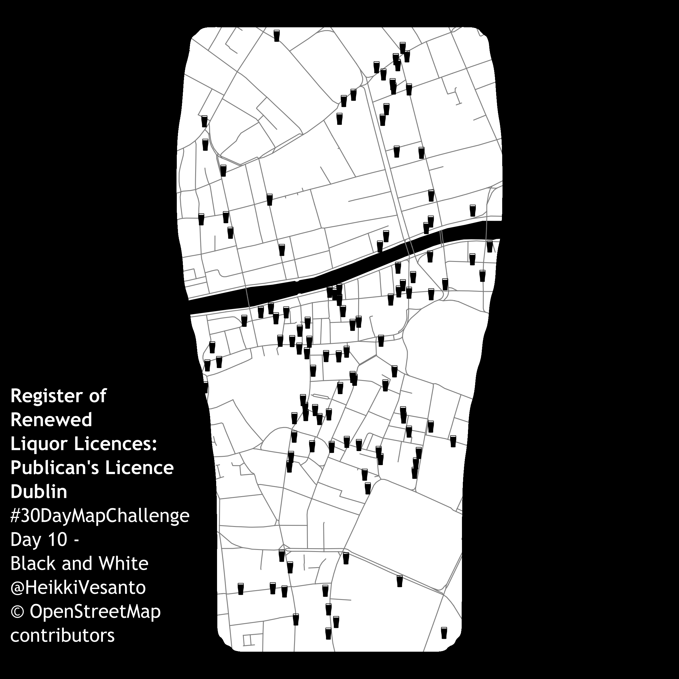
Day 10 – Black and White – Register of renewed liquor licences: Publican’s Houses Dublin:
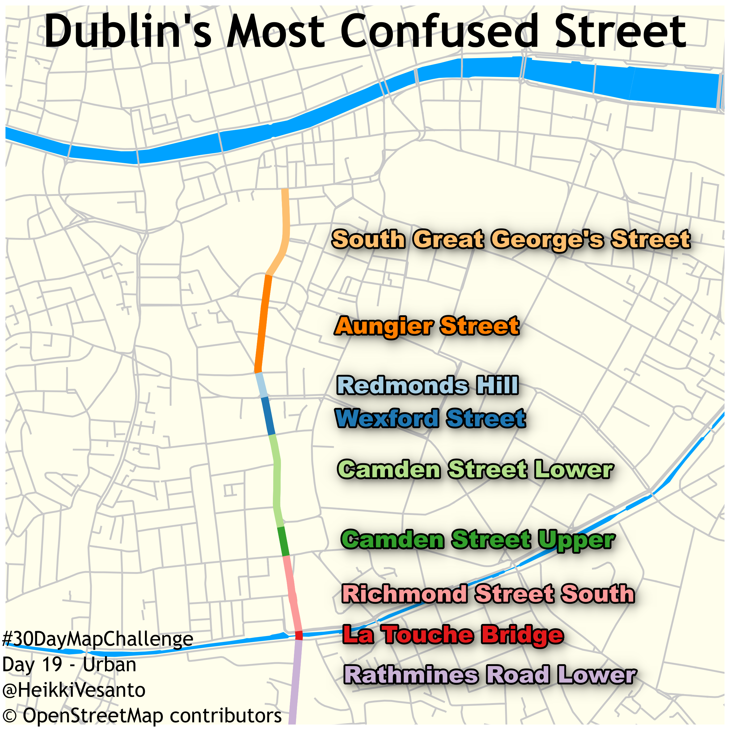
Day 19 – Urban – Perhaps Dublin’s most confused street:
All in all I whole heartedly recommend taking part when November rolls around again.